>>>
Rekindled
>>>
The brand answers
“will I belong here?”
before a word of copy has to.
The brand needed to be luxurious enough to command its price, warm enough to become a weekly ritual.
Industry
Health & Wellness
Tenure
2025-26
8
month tenure developing brand framework, signage and rollout.
True to Finnish heat, Rekindled worked with experts on löyly.
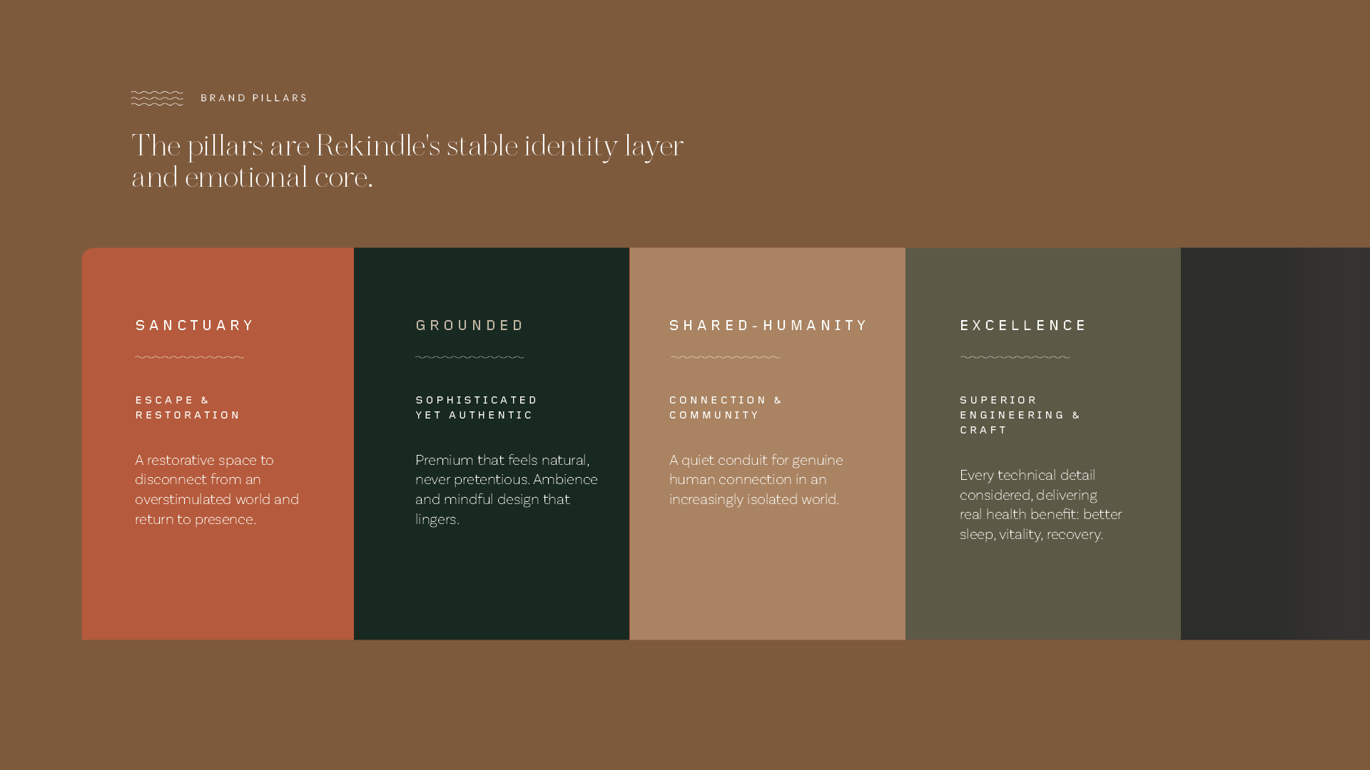
The space is a sanctuary for the busy, over-stimulated mind.
Every human figure is softened, misted, cropped, abstracted. No single body defines an ideal, so every guest can see themselves in it.
Type follows the same discipline, a serif that promises, a tracked sans that structures, a light sans that explains.
Colours reach for grounded, quiet, communal space.
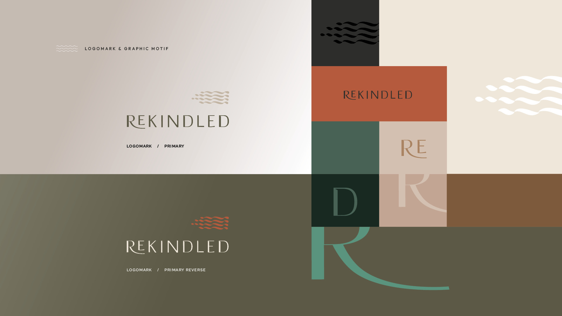
The logomark's wave motif carries the brand's three meanings at once: löyly, water, calm.
Wide, slow, shallow tidal flow settles the pace and lets the mind wonder.
The process examines the customer's silent ask, "does this speak to me?", and then builds a system where each element answers part of it.
G
G
Next
:
Bloom & Grow Learning
Back to Home